Shaunebu.MAUI.CalendarControl
1.0.2
dotnet add package Shaunebu.MAUI.CalendarControl --version 1.0.2
NuGet\Install-Package Shaunebu.MAUI.CalendarControl -Version 1.0.2
This command is intended to be used within the Package Manager Console in Visual Studio, as it uses the NuGet module's version of Install-Package.
<PackageReference Include="Shaunebu.MAUI.CalendarControl" Version="1.0.2" />
For projects that support PackageReference, copy this XML node into the project file to reference the package.
<PackageVersion Include="Shaunebu.MAUI.CalendarControl" Version="1.0.2" />
<PackageReference Include="Shaunebu.MAUI.CalendarControl" />
For projects that support Central Package Management (CPM), copy this XML node into the solution Directory.Packages.props file to version the package.
paket add Shaunebu.MAUI.CalendarControl --version 1.0.2
The NuGet Team does not provide support for this client. Please contact its maintainers for support.
#r "nuget: Shaunebu.MAUI.CalendarControl, 1.0.2"
#r directive can be used in F# Interactive and Polyglot Notebooks. Copy this into the interactive tool or source code of the script to reference the package.
#:package Shaunebu.MAUI.CalendarControl@1.0.2
#:package directive can be used in C# file-based apps starting in .NET 10 preview 4. Copy this into a .cs file before any lines of code to reference the package.
#addin nuget:?package=Shaunebu.MAUI.CalendarControl&version=1.0.2
#tool nuget:?package=Shaunebu.MAUI.CalendarControl&version=1.0.2
The NuGet Team does not provide support for this client. Please contact its maintainers for support.
Shaunebu.MAUI.CalendarControl 📅

Overview ✨
Shaunebu.MAUI.CalendarControl is a professional-grade, fully customizable calendar control for .NET MAUI with:
- 4 view modes — Month, Year, Decade, and Century with drill-up/drill-down navigation
- 4 selection modes — None, Single, Multiple, and Range
- 50+ bindable properties — Full theming, styling, and behavioral customization
- Full MVVM support — Commands for navigation, selection, view changes, and display date changes
- Special dates — Custom backgrounds, text colors, indicator dots, and blackout dates
- Swipe navigation — Left/right swipe gestures for month/year/decade/century navigation
- Culture-aware — Localized month names, day names, and week numbering
- Accessibility —
AutomationPropertieson all day cells with descriptive labels - Cross-platform — Android, iOS, macOS (Mac Catalyst), and Windows
Feature Highlights 🆚
| Feature | Description |
|---|---|
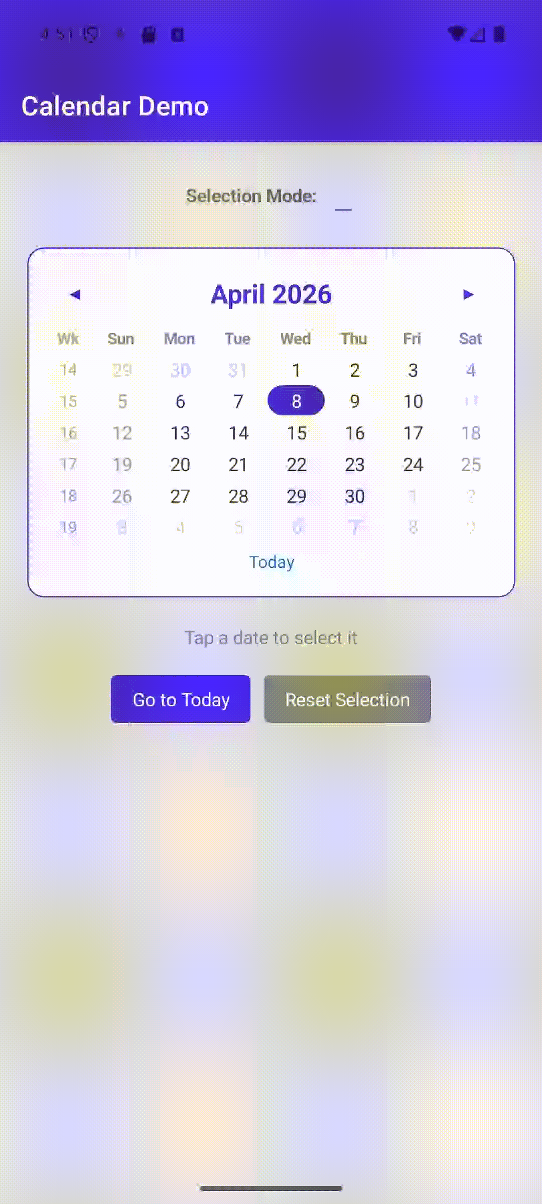
| Month View | 6-row × 7-column day grid with optional week numbers and leading/trailing dates |
| Year View | 3×4 grid of abbreviated month names with selection highlighting |
| Decade View | 3×4 grid of 12 years (1 leading + 10 in-decade + 1 trailing) |
| Century View | 3×4 grid of decade ranges with drill-down navigation |
| Single Selection | Tap to select a single date; auto-navigates to tapped month |
| Multiple Selection | Toggle dates on/off; ObservableCollection<DateTime> backed |
| Range Selection | Two-tap range selection with visual range band |
| Blackout Dates | Dates rendered with strikethrough and disabled interaction |
| Special Dates | Per-date custom background, text color, indicator dot, and blackout flag |
| Min/Max Date | Constrains navigation and disables out-of-range dates |
| Culture Support | Fully localized via CultureInfo — month names, day names, week numbers |
| Header Date Format | Customizable header format string (e.g., "MMM yyyy") |
| Day Name Format | Full (Monday), Abbreviated (Mon), or Shortest (Mo) |
| Swipe Navigation | Left/right swipe gestures on the body grid |
| Today Button | Optional "Today" button for quick navigation to the current date |
| View Navigation | Drill-up (header tap) and drill-down (cell tap) between view levels |
| MVVM Commands | ForwardCommand, BackwardCommand, GoToTodayCommand, ResetSelectionCommand |
| Events + Commands | SelectionChanged, ViewChanged, DisplayDateChanged with both events and bindable commands |
| Accessibility | AutomationProperties.Name and HelpText on every day cell |
Installation 📦
dotnet add package Shaunebu.MAUI.CalendarControl
Or via PackageReference:
<ItemGroup>
  <PackageReference Include="Shaunebu.MAUI.CalendarControl" Version="1.0.x" />
</ItemGroup>
Quick Start 🚀
1. Configure in MauiProgram.cs
using Shaunebu.MAUI.CalendarControl;

public static class MauiProgram
{
    public static MauiApp CreateMauiApp()
    {
        var builder = MauiApp.CreateBuilder();

        builder
            .UseMauiApp<App>()
            .UseShaunebuCalendar();

        return builder.Build();
    }
}
2. Add to XAML
<ContentPage xmlns="http://schemas.microsoft.com/dotnet/2021/maui"
             xmlns:x="http://schemas.microsoft.com/winfx/2009/xaml"
             xmlns:cal="clr-namespace:Shaunebu.MAUI.CalendarControl;assembly=Shaunebu.MAUI.CalendarControl"
             x:Class="MyApp.MainPage">

    <cal:CalendarView
        SelectionMode="Single"
        ShowWeekNumbers="True"
        ShowTodayButton="True"
        FirstDayOfWeek="Monday"
        SelectionChanged="OnSelectionChanged" />

</ContentPage>
3. Handle Selection in Code-Behind
private void OnSelectionChanged(object sender, DateSelectionChangedEventArgs e)
{
    if (e.NewDate.HasValue)
    {
        DisplayAlert("Selected", e.NewDate.Value.ToShortDateString(), "OK");
    }
}
XAML Configuration Examples 🎨
Basic Calendar with Theming
<cal:CalendarView
    SelectionMode="Single"
    ShowWeekNumbers="True"
    ShowTodayButton="True"
    ShowNavigationArrows="True"
    FirstDayOfWeek="Monday"
    DayNameFormat="Abbreviated"
    HeaderBackground="#1976D2"
    HeaderTextColor="White"
    HeaderFontSize="20"
    DayTextColor="#333333"
    DayFontSize="14"
    TodayTextColor="#1976D2"
    TodayBorderColor="#1976D2"
    TodayBackground="Transparent"
    SelectionBackground="#1976D2"
    SelectionTextColor="White"
    WeekendTextColor="#999999"
    DayNamesTextColor="#888888"
    NavigationArrowColor="White"
    CellCornerRadius="20" />
Multiple Selection Mode
<cal:CalendarView
    x:Name="MultiCalendar"
    SelectionMode="Multiple"
    ShowLeadingAndTrailingDates="True" />
// Access selected dates
var dates = MultiCalendar.SelectedDates; // ObservableCollection<DateTime>
Range Selection Mode
<cal:CalendarView
    x:Name="RangeCalendar"
    SelectionMode="Range"
    RangeSelectionBackground="#331976D2" />
// Access selected range
var range = RangeCalendar.SelectedDateRange; // CalendarDateRange
if (range?.StartDate != null && range?.EndDate != null)
{
    // Use range.Contains(someDate) to check membership
}
Min/Max Date Constraints
<cal:CalendarView
    MinDate="{Binding MinimumDate}"
    MaxDate="{Binding MaximumDate}" />
Localized Calendar
<cal:CalendarView
    Culture="{Binding SelectedCulture}"
    HeaderDateFormat="MMMM yyyy"
    DayNameFormat="Shortest" />
MVVM Integration 🏗
Binding to Commands
<cal:CalendarView
    SelectionMode="Single"
    SelectedDate="{Binding SelectedDate, Mode=TwoWay}"
    DisplayDate="{Binding DisplayDate, Mode=TwoWay}"
    SelectionChangedCommand="{Binding DateSelectedCommand}"
    DisplayDateChangedCommand="{Binding MonthNavigatedCommand}"
    ViewChangedCommand="{Binding ViewDrilledCommand}"
    ForwardCommand="{Binding GoForwardCommand}"
    BackwardCommand="{Binding GoBackwardCommand}"
    GoToTodayCommand="{Binding NavigateToTodayCommand}"
    ResetSelectionCommand="{Binding ClearSelectionCommand}" />
ViewModel Example
public partial class CalendarViewModel : ObservableObject
{
    [ObservableProperty]
    private DateTime? selectedDate = DateTime.Today;

    [ObservableProperty]
    private DateTime displayDate = new(DateTime.Today.Year, DateTime.Today.Month, 1);

    [RelayCommand]
    private void DateSelected(DateSelectionChangedEventArgs e)
    {
        if (e.NewDate.HasValue)
        {
            // Handle date selection
            Debug.WriteLine($"Selected: {e.NewDate.Value:d}");
        }
    }

    [RelayCommand]
    private void MonthNavigated(DisplayDateChangedEventArgs e)
    {
        Debug.WriteLine($"Navigated from {e.OldDate:MMMM yyyy} to {e.NewDate:MMMM yyyy}");
    }
}
Special Dates & Blackout Dates 📌
Configure Special Dates
var calendar = new CalendarView();

// Add special dates with custom styling
calendar.SpecialDates.Add(new CalendarSpecialDate
{
    Date = new DateTime(2025, 12, 25),
    Background = Colors.Red,
    TextColor = Colors.White,
    IndicatorColor = Colors.Gold
});

// Add a blackout date via special dates
calendar.SpecialDates.Add(new CalendarSpecialDate
{
    Date = new DateTime(2025, 1, 1),
    IsBlackout = true
});

// Add blackout dates directly
calendar.BlackoutDates.Add(new DateTime(2025, 7, 4));
calendar.BlackoutDates.Add(new DateTime(2025, 11, 27));
Special Date Properties
| Property | Type | Description |
|---|---|---|
Date |
DateTime |
The date to customize |
Background |
Color? |
Custom background color for the cell |
TextColor |
Color? |
Custom text color for the day number |
IndicatorColor |
Color? |
Color of a small dot indicator beneath the day number |
IsBlackout |
bool |
If true, the date is disabled with strikethrough styling |
Public Methods 🔧
| Method | Description |
|---|---|
Forward() |
Navigate to the next month / year / decade / century |
Backward() |
Navigate to the previous month / year / decade / century |
GoToToday() |
Navigate to today's date and switch to Month view |
GoToDate(DateTime date) |
Navigate to show the specified date in Month view |
ResetSelection() |
Clear all selections across all modes |
Bindable Properties Reference 📚
Selection Properties
| Property | Type | Default | Description |
|---|---|---|---|
SelectedDate |
DateTime? |
DateTime.Today |
Selected date in Single mode |
SelectedDates |
ObservableCollection<DateTime> |
Empty | Selected dates in Multiple mode |
SelectedDateRange |
CalendarDateRange? |
null |
Selected range in Range mode |
SelectionMode |
CalendarSelectionMode |
Single |
None, Single, Multiple, or Range |
Display & Navigation Properties
| Property | Type | Default | Description |
|---|---|---|---|
DisplayDate |
DateTime |
First of current month | Controls which month/year is displayed |
View |
CalendarViewMode |
Month |
Current view mode |
MinView |
CalendarViewMode |
Month |
Minimum drill-down level |
MaxView |
CalendarViewMode |
Century |
Maximum drill-up level |
MinDate |
DateTime? |
null |
Earliest navigable/selectable date |
MaxDate |
DateTime? |
null |
Latest navigable/selectable date |
FirstDayOfWeek |
DayOfWeek |
Culture default | First day of the week |
AllowViewNavigation |
bool |
true |
Enable header tap drill-up and cell drill-down |
Visibility Properties
| Property | Type | Default | Description |
|---|---|---|---|
ShowLeadingAndTrailingDates |
bool |
true |
Show dates from adjacent months |
ShowWeekNumbers |
bool |
false |
Show ISO week numbers column |
ShowTodayButton |
bool |
false |
Show "Today" button below calendar |
ShowNavigationArrows |
bool |
true |
Show forward/backward arrow buttons |
Formatting Properties
| Property | Type | Default | Description |
|---|---|---|---|
Culture |
CultureInfo |
CurrentCulture |
Culture for localized formatting |
HeaderDateFormat |
string? |
null (= "MMMM yyyy") |
Custom header date format string |
DayNameFormat |
CalendarDayNameFormat |
Abbreviated |
Day name display format |
Styling Properties
| Property | Type | Default | Description |
|---|---|---|---|
HeaderBackground |
Color |
Transparent |
Header row background |
HeaderTextColor |
Color |
#333333 |
Header label text color |
HeaderFontSize |
double |
18.0 |
Header label font size |
DayTextColor |
Color |
#333333 |
Default day number text color |
DayFontSize |
double |
14.0 |
Day number font size |
TodayBackground |
Color |
Transparent |
Today cell background |
TodayTextColor |
Color |
#1976D2 |
Today cell text color |
TodayBorderColor |
Color |
#1976D2 |
Today cell border ring color |
SelectionBackground |
Color |
#1976D2 |
Selected cell background |
SelectionTextColor |
Color |
White |
Selected cell text color |
RangeSelectionBackground |
Color |
#331976D2 |
Range band background |
WeekendTextColor |
Color |
#999999 |
Weekend day text color |
TrailingLeadingTextColor |
Color |
#CCCCCC |
Adjacent month day text color |
DisabledTextColor |
Color |
#DDDDDD |
Disabled/out-of-range text color |
DayNamesTextColor |
Color |
#888888 |
Day-of-week header text color |
DayNamesFontSize |
double |
12.0 |
Day-of-week header font size |
WeekNumberTextColor |
Color |
#AAAAAA |
Week number text color |
WeekNumberBackground |
Color |
Transparent |
Week number column background |
NavigationArrowColor |
Color |
#333333 |
Navigation arrow button color |
CellCornerRadius |
double |
20 |
Corner radius for selected/today cells |
Command Properties (MVVM)
| Property | Type | Description |
|---|---|---|
SelectionChangedCommand |
ICommand |
Invoked when selection changes |
SelectionChangedCommandParameter |
object |
Parameter for SelectionChangedCommand |
ViewChangedCommand |
ICommand |
Invoked when view mode changes |
ViewChangedCommandParameter |
object |
Parameter for ViewChangedCommand |
DisplayDateChangedCommand |
ICommand |
Invoked when display date changes |
DisplayDateChangedCommandParameter |
object |
Parameter for DisplayDateChangedCommand |
ForwardCommand |
ICommand |
Navigate forward command |
BackwardCommand |
ICommand |
Navigate backward command |
GoToTodayCommand |
ICommand |
Go to today command |
ResetSelectionCommand |
ICommand |
Reset selection command |
Events 📡
| Event | EventArgs | Description |
|---|---|---|
SelectionChanged |
DateSelectionChangedEventArgs |
Raised when user changes selection |
ViewChanged |
CalendarViewChangedEventArgs |
Raised when the view mode changes |
DisplayDateChanged |
DisplayDateChangedEventArgs |
Raised when navigating to a different month/year |
DateSelectionChangedEventArgs
| Property | Type | Description |
|---|---|---|
NewDate |
DateTime? |
Newly selected date (Single mode) |
OldDate |
DateTime? |
Previously selected date (Single mode) |
AddedDates |
IReadOnlyList<DateTime>? |
Dates added (Multiple mode) |
RemovedDates |
IReadOnlyList<DateTime>? |
Dates removed (Multiple mode) |
NewRange |
CalendarDateRange? |
New range (Range mode) |
OldRange |
CalendarDateRange? |
Previous range (Range mode) |
Architecture Overview 🏗
┌────────────────────────────────────────────────────────────────────┐
│              Shaunebu.MAUI.CalendarControl                         │
├────────────────────────────────────────────────────────────────────┤
│ Controls/                                                          │
│   CalendarView.cs          Main ContentView control (~1500 lines)  │
│     ├─ Bindable Properties   50+ configurable properties           │
│     ├─ Rendering Engine      Month / Year / Decade / Century views │
│     ├─ Selection Handling    Single / Multiple / Range / None      │
│     ├─ Navigation            Forward / Backward / DrillUp / Down   │
│     ├─ MVVM Commands         8 bindable ICommand properties        │
│     └─ Accessibility         AutomationProperties on all cells     │
├────────────────────────────────────────────────────────────────────┤
│ Enums/                                                             │
│   CalendarViewMode.cs       Month | Year | Decade | Century        │
│   CalendarSelectionMode.cs  None | Single | Multiple | Range       │
│   CalendarDayNameFormat.cs  Full | Abbreviated | Shortest          │
├────────────────────────────────────────────────────────────────────┤
│ Models/                                                            │
│   CalendarDateRange.cs      Start/End date range with Contains()   │
│   CalendarSpecialDate.cs    Per-date visual customization model    │
├────────────────────────────────────────────────────────────────────┤
│ Events/                                                            │
│   DateSelectionChangedEventArgs.cs    Multi-mode selection args    │
│   CalendarViewChangedEventArgs.cs     View mode change args        │
│   DisplayDateChangedEventArgs.cs      Display date change args     │
├────────────────────────────────────────────────────────────────────┤
│ Extensions/                                                        │
│   AppBuilderExtensions.cs   UseShaunebuCalendar() registration     │
├────────────────────────────────────────────────────────────────────┤
│ Platforms/                                                         │
│   Android/   iOS/   MacCatalyst/   Windows/                        │
└────────────────────────────────────────────────────────────────────┘
Advanced Usage Scenarios 🔥
Booking / Scheduling Calendar
var calendar = new CalendarView
{
    SelectionMode = CalendarSelectionMode.Range,
    MinDate = DateTime.Today,
    MaxDate = DateTime.Today.AddMonths(6),
    ShowTodayButton = true
};

// Block out unavailable dates
foreach (var bookedDate in existingBookings)
    calendar.BlackoutDates.Add(bookedDate);

// Highlight available premium slots
foreach (var slot in premiumSlots)
{
    calendar.SpecialDates.Add(new CalendarSpecialDate
    {
        Date = slot,
        IndicatorColor = Colors.Gold,
        Background = Color.FromArgb("#FFF8E1")
    });
}
Multi-Tenant Event Calendar
// Mark event dates with color-coded indicators
calendar.SpecialDates.Add(new CalendarSpecialDate
{
    Date = meetingDate,
    IndicatorColor = Colors.Blue
});

calendar.SpecialDates.Add(new CalendarSpecialDate
{
    Date = deadlineDate,
    IndicatorColor = Colors.Red,
    TextColor = Colors.Red
});

calendar.SpecialDates.Add(new CalendarSpecialDate
{
    Date = holidayDate,
    IsBlackout = true
});
Culture-Aware International Calendar
var calendar = new CalendarView
{
    Culture = new CultureInfo("ar-SA"),        // Arabic (Saudi Arabia)
    FirstDayOfWeek = DayOfWeek.Saturday,
    DayNameFormat = CalendarDayNameFormat.Shortest,
    HeaderDateFormat = "MMMM yyyy"
};
Programmatic Navigation
// Navigate to a specific date
calendar.GoToDate(new DateTime(2025, 12, 25));

// Navigate forward/backward
calendar.Forward();
calendar.Backward();

// Jump to today
calendar.GoToToday();

// Clear all selections
calendar.ResetSelection();
Supported Platforms 📱
| Platform | Minimum Version | Target Frameworks |
|---|---|---|
| Android | API 21 (Lollipop) | net9.0-android, net10.0-android |
| iOS | 15.0 | net9.0-ios, net10.0-ios |
| macOS | Mac Catalyst 15.0 | net9.0-maccatalyst, net10.0-maccatalyst |
| Windows | 10.0.17763.0 | net9.0-windows10.0.19041.0, net10.0-windows10.0.19041.0 |
Troubleshooting 🔧
Calendar Not Rendering
- Ensure
UseShaunebuCalendar()is called inMauiProgram.cs - Verify the XAML namespace:
xmlns:cal="clr-namespace:Shaunebu.MAUI.CalendarControl;assembly=Shaunebu.MAUI.CalendarControl"
Selection Not Working
- Check that
SelectionModeis not set toNone - Verify the date is not in
BlackoutDatesorSpecialDateswithIsBlackout = true - Ensure the date is within
MinDate/MaxDatebounds
Navigation Arrows Disabled
- The arrows automatically disable when
MinDate/MaxDateboundaries are reached - Verify
ShowNavigationArrowsistrue
View Drill-Up/Down Not Working
- Set
AllowViewNavigation="True"(default) - The header label must be tapped to drill up
- View navigation respects
MinViewandMaxViewbounds
Week Numbers Not Showing
- Set
ShowWeekNumbers="True" - Week numbers use the
Cultureproperty's calendar week rule
License 📄
This project is licensed under the MIT License.
| Product | Versions Compatible and additional computed target framework versions. |
|---|---|
| .NET | net9.0 is compatible. net9.0-android was computed. net9.0-android35.0 is compatible. net9.0-browser was computed. net9.0-ios was computed. net9.0-ios18.0 is compatible. net9.0-maccatalyst was computed. net9.0-maccatalyst18.0 is compatible. net9.0-macos was computed. net9.0-tvos was computed. net9.0-windows was computed. net9.0-windows10.0.19041 is compatible. net10.0 is compatible. net10.0-android was computed. net10.0-android36.0 is compatible. net10.0-browser was computed. net10.0-ios was computed. net10.0-ios26.0 is compatible. net10.0-maccatalyst was computed. net10.0-maccatalyst26.0 is compatible. net10.0-macos was computed. net10.0-tvos was computed. net10.0-windows was computed. net10.0-windows10.0.19041 is compatible. |
Compatible target framework(s)
Included target framework(s) (in package)
Learn more about Target Frameworks and .NET Standard.
-
net10.0
- Microsoft.Maui.Controls (>= 10.0.20)
-
net10.0-android36.0
- Microsoft.Maui.Controls (>= 10.0.20)
-
net10.0-ios26.0
- Microsoft.Maui.Controls (>= 10.0.20)
-
net10.0-maccatalyst26.0
- Microsoft.Maui.Controls (>= 10.0.20)
-
net10.0-windows10.0.19041
- Microsoft.Maui.Controls (>= 10.0.20)
-
net9.0
- Microsoft.Maui.Controls (>= 9.0.120)
-
net9.0-android35.0
- Microsoft.Maui.Controls (>= 9.0.120)
-
net9.0-ios18.0
- Microsoft.Maui.Controls (>= 9.0.120)
-
net9.0-maccatalyst18.0
- Microsoft.Maui.Controls (>= 9.0.120)
-
net9.0-windows10.0.19041
- Microsoft.Maui.Controls (>= 9.0.120)
NuGet packages
This package is not used by any NuGet packages.
GitHub repositories
This package is not used by any popular GitHub repositories.