Material3.WinForms
0.6.0
dotnet add package Material3.WinForms --version 0.6.0
NuGet\Install-Package Material3.WinForms -Version 0.6.0
<PackageReference Include="Material3.WinForms" Version="0.6.0" />
<PackageVersion Include="Material3.WinForms" Version="0.6.0" />
<PackageReference Include="Material3.WinForms" />
paket add Material3.WinForms --version 0.6.0
#r "nuget: Material3.WinForms, 0.6.0"
#:package Material3.WinForms@0.6.0
#addin nuget:?package=Material3.WinForms&version=0.6.0
#tool nuget:?package=Material3.WinForms&version=0.6.0
Material3.WinForms


Material 3 (Material You) for Windows Forms — drop-in design tokens and owner-drawn controls. Dynamic color from a single seed, runtime light/dark switching, the full M3 type scale, elevation, state layers and motion. No mandatory base form, no native dependencies.
<p align="center"> <img src="https://raw.githubusercontent.com/dary1337/material3-winforms/main/docs/img/dynamic-color.gif" alt="Dragging the seed hue recolors the whole palette live in the Material 3 gallery" width="820"> </p> <p align="center"><sub>Drag the seed hue — the entire palette recolors live through the HCT pipeline.</sub></p>
Existing "Material for WinForms" libraries implement Material 2 and are largely unmaintained. This project targets the current spec: HCT tonal palettes, color roles, surface containers and the 2023+ component look.
Status: preview (0.6). Foundation, the core component catalog and WinForms designer support are complete.
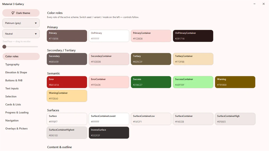
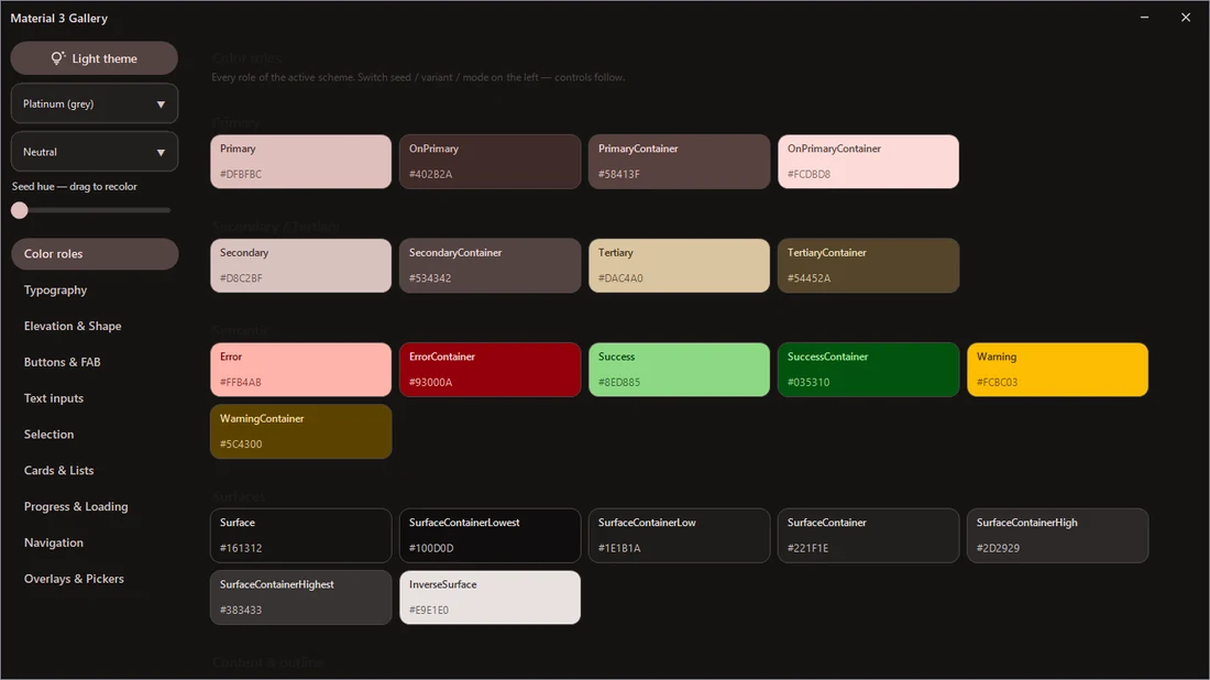
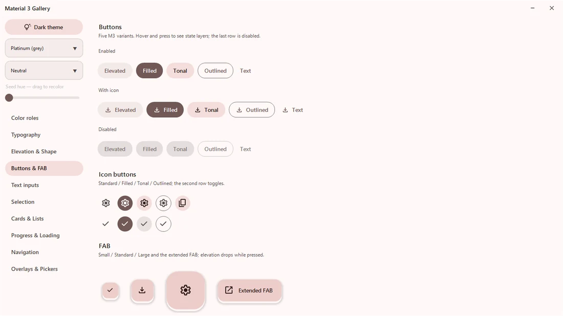
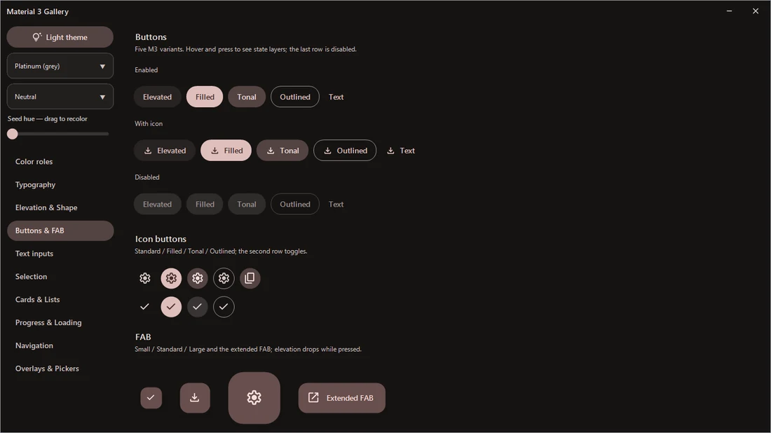
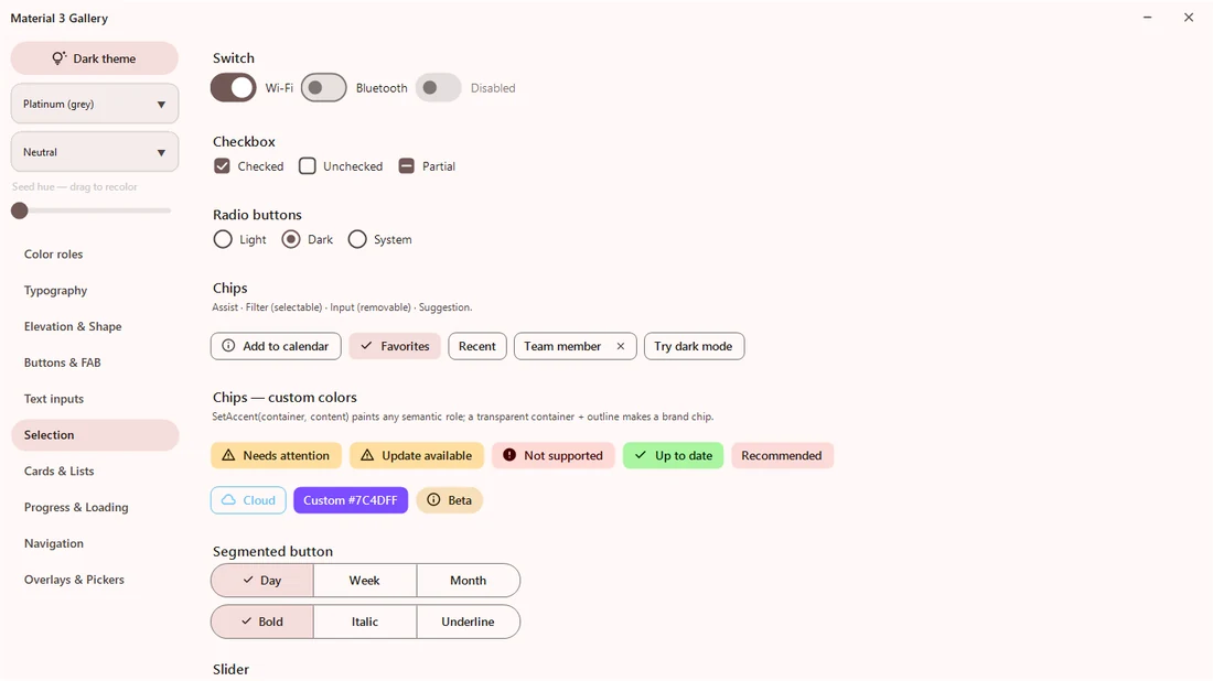
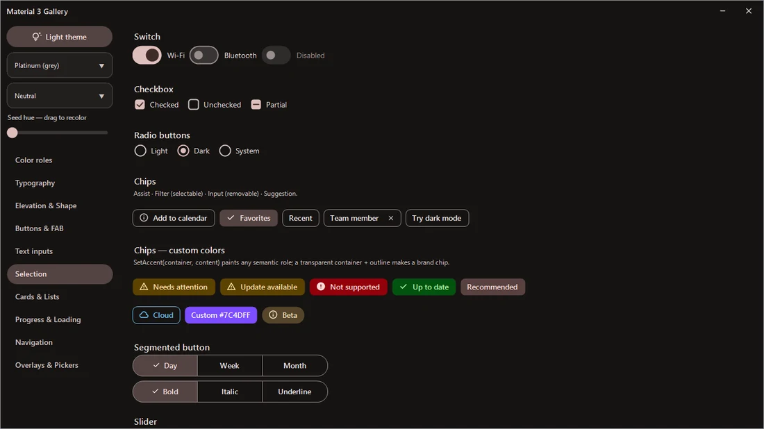
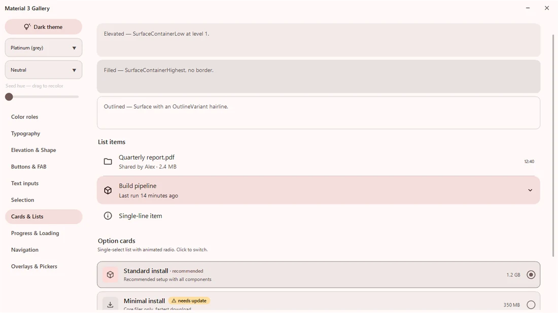
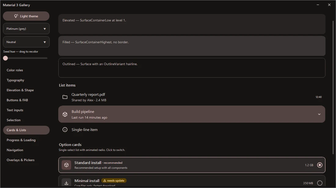
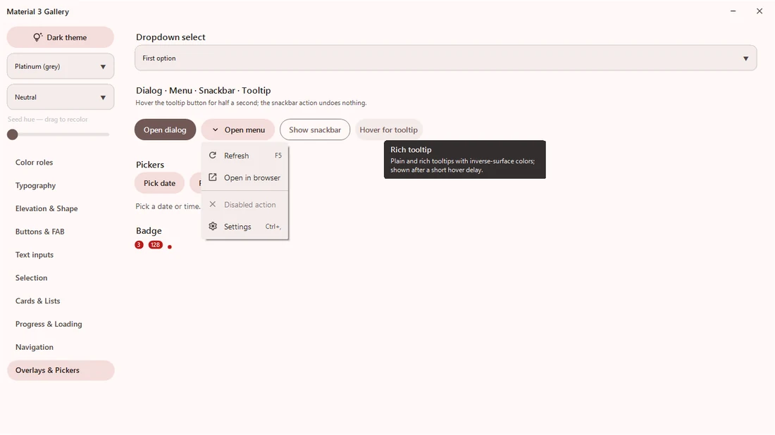
Screenshots
The same gallery pages in light and dark — every control follows the active scheme. Rows: color roles · buttons & FAB · selection · cards & lists · overlays & pickers.
| Light | Dark |
|---|---|
 |
 |
 |
 |
 |
 |
 |
 |
 |
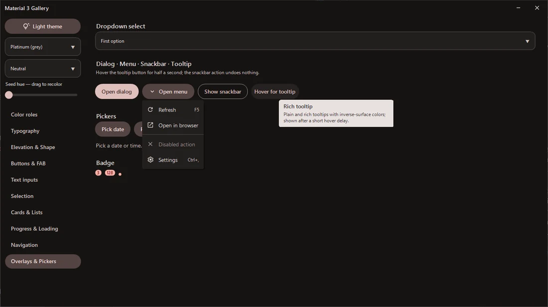 |
<sub>Screenshots and demos captured on v0.5.</sub>
Features
- Dynamic color — full light + dark
ColorSchemegenerated from one seed color through a C# port of the HCT/CAM16 pipeline (no native dependencies). Three variants:TonalSpot(M3 default),Neutral(near-monochrome),Vibrant. - Runtime theme switching —
ThemeManager.IsDark = falserepaints every subscribed control; no restart, no per-control wiring. - Color roles — all M3 roles including the six surface containers, inverse roles, outline
pair, plus shared
Success/Warningextensions. - Type scale — all 15 styles (Display → Label) on Segoe UI with letter-spacing and line-height metadata GDI fonts can't carry.
- Elevation 0–5 — painted soft shadows (WinForms has no compositor) + per-level surface tint.
- State layers — spec opacities for hover / focus / pressed / dragged, used consistently by every control.
- Motion tokens — M3 duration scale and cubic-bezier easings (standard + emphasized) evaluated exactly like CSS timing functions.
- Material Symbols — 30+ icons embedded as SVG, rasterized with caching and tinted to any role color.
- Designer support — controls drop from the toolbox with their M3 properties grouped under a
Material Design category, and a non-visual
MaterialThemeManagercomponent drives the theme from the property grid — noThemeManager.ApplyinMain— while previewing it live on the design surface. SmartTags and a glyph picker on key controls (.NET Framework designer).
Controls
| Family | Included |
|---|---|
| Actions | MaterialButton (5 variants), MaterialIconButton (4 styles + toggle), MaterialFab (small / standard / large / extended), MaterialSegmentedButton |
| Text inputs | MaterialTextField (filled + outlined, floating label, error state, icons), MaterialSearchBar |
| Selection | MaterialSwitch, MaterialCheckBox (incl. indeterminate), MaterialRadioButton, MaterialChip (assist / filter / input / suggestion), MaterialSlider, MaterialOptionCard, DropdownSelect |
| Navigation | MaterialTabs (primary / secondary), MaterialNavigationBar, MaterialNavigationRail, MaterialNavigationDrawer |
| Communication | MaterialProgressBar (linear), MaterialCircularProgress (determinate + indeterminate), MaterialSnackbar, MaterialBadge, MaterialTooltip (plain + rich), MaterialSkeleton (compose any shimmer placeholder) + SkeletonCard preset, StepChecklist |
| Containment | MaterialCard (elevated / filled / outlined), MaterialListItem, MaterialDivider, RoundedPanel, MaterialScrollPanel (overlay scrollbar), MaterialMenu |
| Dialogs | MaterialDialog, MaterialMessageBox (themed info / error / confirm), MaterialDatePickerDialog (calendar grid), MaterialTimePickerDialog (time input) |
| Window | BorderlessForm (native resize/snap without chrome), MaterialTitleBar (minimize / maximize / close, each hideable), WindowChrome (DWM caption theming), FormDragAnywhere, TaskbarProgress, FormAnimation |
| Text | SoftLabel (consistent GDI+ rendering) |
Quickstart
using Material3.WinForms.Theming;

[STAThread]
static void Main() {
    Application.EnableVisualStyles();

    // One line of theming: every Material control follows this scheme.
    ThemeManager.Apply(MaterialTheme.FromSeed(Color.FromArgb(0x67, 0x50, 0xA4)), isDark: true);

    Application.Run(new MainForm());
}
Prefer the designer? Drop a MaterialThemeManager onto your form and set Seed / Variant /
IsDark in the property grid — it applies the theme at run time (so you can skip the Main call
above) and previews it on the design surface.
// Switch mode at runtime — all controls repaint themselves.
ThemeManager.IsDark = !ThemeManager.IsDark;

// Or swap the whole palette.
ThemeManager.Theme = MaterialTheme.FromSeed(Color.SeaGreen, SchemeVariant.Vibrant);
var save = new MaterialButton {
    Text = "Save",
    Variant = MaterialButtonVariant.Filled,
    IconGlyph = MaterialIcons.Check,
};
Custom drawing uses the same tokens the stock controls do:
using Material3.WinForms.Theming;   // MaterialColors — current scheme roles
using Material3.WinForms.Tokens;    // Shape, Spacing, StateLayers, Motion, Elevation
using Material3.WinForms.Typography; // MaterialType — the 15-style type scale
Gallery
samples/Material3.Gallery is a live component catalog: every color role, the full type scale,
elevation levels, all button variants and every control in both modes. Run it to smoke-test
changes or to grab screenshots.
dotnet build Material3.WinForms.sln
samples\Material3.Gallery\bin\Debug\net472\Material3.Gallery.exe
Designer support
The controls are built for the Visual Studio designer, not just code:
- Toolbox & property grid — every control is a
[ToolboxItem]; its M3 properties sit under a Material Design category with descriptions and defaults, and the design surface paints with the live theme instead of a blank rectangle. MaterialThemeManagercomponent — drop it on a form and pickSeed/Variant/IsDarkin the grid; it applies the theme at run time (no manualThemeManager.Apply) and repaints the preview so design-time matches the running app.- SmartTags & editors (.NET Framework designer) — quick
Variant/ glyph actions onMaterialButtonandMaterialTextField, plus a Material Symbols picker forIconGlyph.
On .NET 8 the toolbox, property grid and live preview work the same; the SmartTag/editor extras are .NET Framework-only for now (the out-of-process .NET designer would need a separate design-time assembly).
High-DPI
The controls scale their owner-drawn geometry to the monitor DPI (via Control.DeviceDpi), so they
stay crisp at 125/150/200%. DPI awareness is a process-level setting that the host application
must opt into — a referenced DLL cannot set it. In your app:
- declare awareness in your
app.manifest:<dpiAware>true</dpiAware>(System-DPI) is enough forControl.DeviceDpito report the real DPI. For Per-Monitor V2, add<dpiAwareness>PerMonitorV2</dpiAwareness>to the manifest — or, on .NET Framework, anapp.config<System.Windows.Forms.ApplicationConfigurationSection>with<add key="DpiAwareness" value="PerMonitorV2" />. On .NET 8 you can instead callApplication.SetHighDpiMode(...). - set
AutoScaleMode = AutoScaleMode.Dpion your forms.
That's all — the Material controls then render crisply with no extra code. See
samples/Material3.Gallery/app.manifest for a working example. If you do your own owner-drawing with
the shared tokens, Material3.WinForms.Dpi.Scale(control, px) is the same helper the controls use.
Requirements
- .NET Framework 4.7.2+ or .NET 8 (
net8.0-windows) - Windows 10+ recommended (DWM caption theming and rounded corners degrade gracefully on older builds)
Acknowledgements
The HCT color pipeline is a C# port of Google's material-color-utilities (Apache 2.0). Icons are Material Symbols (Apache 2.0).
License
MIT © dary1337
| Product | Versions Compatible and additional computed target framework versions. |
|---|---|
| .NET | net8.0-windows7.0 is compatible. net9.0-windows was computed. net10.0-windows was computed. |
| .NET Framework | net472 is compatible. net48 was computed. net481 was computed. |
-
.NETFramework 4.7.2
- No dependencies.
-
net8.0-windows7.0
- No dependencies.
NuGet packages
This package is not used by any NuGet packages.
GitHub repositories
This package is not used by any popular GitHub repositories.