BlazorCssGrid 1.0.0
See the version list below for details.
dotnet add package BlazorCssGrid --version 1.0.0
NuGet\Install-Package BlazorCssGrid -Version 1.0.0
<PackageReference Include="BlazorCssGrid" Version="1.0.0" />
paket add BlazorCssGrid --version 1.0.0
#r "nuget: BlazorCssGrid, 1.0.0"
// Install BlazorCssGrid as a Cake Addin
#addin nuget:?package=BlazorCssGrid&version=1.0.0

// Install BlazorCssGrid as a Cake Tool
#tool nuget:?package=BlazorCssGrid&version=1.0.0
Blazor CSS Grid layout library
This blazor component makes it super easy to create application layouts for WebApps that look exactly how you want them to.
Built 100% using CSS
This library is built using <a href="https://www.w3schools.com/css/css_grid.asp">CSS Grids</a> which means there are no JS or CSS libraries to install.
It's usage is inspired by the kind of layouts you can achieve using XAML Grid Controls, and if you are familiar with laying out an application's controls using grid semantics this will be very familiar to you.
Install
Simply add a nuget package reference to BlazorCssGrid
dotnet add BlazorCssGrid
Usage
There are 2 controls
- GridContainer - Define the shapes of Rows and Columns
- GridItem - Wrapper around any component which defines where the component should be rendered.
GridContainer
The grid container defines the rows and columns for the grid.
| Property | Description | Example |
|---|---|---|
| Columns | defines the number and width of columns, | auto 1fr auto |
| Rows | defines the number and height of rows | auto 1fr auto |
| ColumnGap | defines the spacing between each column | 10px |
| RowGap | defines the spacing between each row | 10px |
GridItem
A grid item wraps content and adds data which controls the positioning of the content.
Any grid item can be made to have horizontal and/or vertical scroll bars, allowing the content to scroll.
| Property | Description | Example | ||
|---|---|---|---|---|
| Column | defines the column number to render the content. (starting at 1), | 2 | ||
| Row | defines the row number to render the content. (starting at 1) | 2 | ||
| ColumnSpan | defines the the number of additional columns to span. (2 = 2 columns, 3 = 3 columns, etc.) | 3 | ||
| RowSpan | defines the number of additional rows to span (2 = 2 rows, 3 = 3 rows, etc.) | 2 | ||
| HorizontalScrollbar | allows you to scroll gridItem horizontally (none | auto | show) | auto |
| VerticalScrollbar | allows you to scroll gridItem vertically (none | auto | show) | auto |
Example
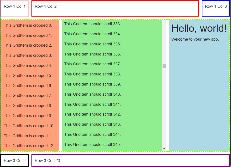
<GridContainer Rows="auto 1fr auto" Columns="auto 1fr auto" ColumnGap="10px" RowGap="10px">

    <GridItem Row="1" Column="1" style="border-color: pink; border-style:solid;padding:10px;">
        <p>Row 1 Col 1</p>
    </GridItem>

    <GridItem Row="1" Column="2" style="border-color: red; border-style:solid;padding:10px;">
        <p>Row 1 Col 2</p>
    </GridItem>

    <GridItem Row="1" Column="3" style="border-color: blue; border-style:solid;padding:10px;">
        <p>Row 1 Col 3</p>
    </GridItem>


    <GridItem Row="2" Column="1" ColumnSpan="3" Style="border-color:chartreuse; border-style:dashed;">

        <GridContainer Columns="100px 1fr 100px" RowGap="10px" ColumnGap="10px" >

            <GridItem Column="1" style="background-color:lightsalmon;padding:10px;">
                @for (int i = 0; i < 1000; i++)
                {
                    <p>This GridItem is cropped @i.</p>
                }
            </GridItem>


            <GridItem Column="2" VerticalScrollbar="Auto" Style="background-color: lightgreen;padding:10px;">
                @for (int i = 0; i < 1000; i++)
                {
                    <p>This GridItem should scroll @i.</p>
                }
            </GridItem>


            <GridItem Column="3" style="background-color: lightblue;padding:10px;">
                @Body
            </GridItem>

        </GridContainer>

    </GridItem>


    <GridItem Row="3" Column="1" style="border-color: black; border-style:solid;padding:10px;">
        Row 3 Col 2
    </GridItem>

    <GridItem Row="3" Column="2" ColumnSpan="2" style="border-color: purple; border-style: solid; padding: 10px;">
        Row 3 Col 2/3<br />
    </GridItem>
</GridContainer>
Important CSS trick for full screen layouts.
If you are using a Grid layout for your SPA you probably want your grid to fill the whole visible screen in a web browser.
You can do this with the 100vh and 100vw width and height definitions, but you will find that many browsers end up adding
a scrollbar when you do this.
The solution is easy, you simply need to disable the extra margins. In your CSS you can disable the padding and margin the browser is adding by simply adding this bit of CSS:
* {
    box-sizing: border-box;
    padding: 0;
    margin: 0;
}
Now you can have your root grid container simply set the height and width to 100vh/100vw like this:
<GridContainer height="100vh" width="100vh">
...
</GridContainer>
| Product | Versions Compatible and additional computed target framework versions. |
|---|---|
| .NET | net5.0 was computed. net5.0-windows was computed. net6.0 was computed. net6.0-android was computed. net6.0-ios was computed. net6.0-maccatalyst was computed. net6.0-macos was computed. net6.0-tvos was computed. net6.0-windows was computed. net7.0 was computed. net7.0-android was computed. net7.0-ios was computed. net7.0-maccatalyst was computed. net7.0-macos was computed. net7.0-tvos was computed. net7.0-windows was computed. net8.0 was computed. net8.0-android was computed. net8.0-browser was computed. net8.0-ios was computed. net8.0-maccatalyst was computed. net8.0-macos was computed. net8.0-tvos was computed. net8.0-windows was computed. |
| .NET Core | netcoreapp2.0 was computed. netcoreapp2.1 was computed. netcoreapp2.2 was computed. netcoreapp3.0 was computed. netcoreapp3.1 was computed. |
| .NET Standard | netstandard2.0 is compatible. netstandard2.1 was computed. |
| .NET Framework | net461 was computed. net462 was computed. net463 was computed. net47 was computed. net471 was computed. net472 was computed. net48 was computed. net481 was computed. |
| MonoAndroid | monoandroid was computed. |
| MonoMac | monomac was computed. |
| MonoTouch | monotouch was computed. |
| Tizen | tizen40 was computed. tizen60 was computed. |
| Xamarin.iOS | xamarinios was computed. |
| Xamarin.Mac | xamarinmac was computed. |
| Xamarin.TVOS | xamarintvos was computed. |
| Xamarin.WatchOS | xamarinwatchos was computed. |
-
.NETStandard 2.0
- Microsoft.AspNetCore.Components (>= 3.1.0)
- Microsoft.AspNetCore.Components.Web (>= 3.1.0)
NuGet packages
This package is not used by any NuGet packages.
GitHub repositories
This package is not used by any popular GitHub repositories.