AvaloniaDiagramerControl 1.0.0
dotnet add package AvaloniaDiagramerControl --version 1.0.0
NuGet\Install-Package AvaloniaDiagramerControl -Version 1.0.0
<PackageReference Include="AvaloniaDiagramerControl" Version="1.0.0" />
<PackageVersion Include="AvaloniaDiagramerControl" Version="1.0.0" />
<PackageReference Include="AvaloniaDiagramerControl" />
paket add AvaloniaDiagramerControl --version 1.0.0
#r "nuget: AvaloniaDiagramerControl, 1.0.0"
#:package AvaloniaDiagramerControl@1.0.0
#addin nuget:?package=AvaloniaDiagramerControl&version=1.0.0
#tool nuget:?package=AvaloniaDiagramerControl&version=1.0.0
AvaloniaDiagramerControl
A powerful, customizable multi-series line chart control for Avalonia UI applications. This control allows you to visualize multiple data series with trend lines, customizable styling, and interactive features.
Features
- Multiple Data Series: Display up to 10 different data series simultaneously
- Trend Lines: Polynomial regression trend lines with configurable degree
- Customizable Styling: Full control over colors, fonts, line weights, and backgrounds
- Interactive Flashing: Highlight specific data series with animated flashing
- Flexible Layout: Responsive design that adapts to container size
- Grid Support: Optional grid overlay for easier data reading
- Knot Markers: Visual markers at data points
- Alternating Backgrounds: Improved readability with alternating background colors
- Anti-aliasing: Smooth, professional-looking lines
Installation
- Add a reference to
AvaloniaDiagramerControl.Controlsin your Avalonia project - Add the namespace to your AXAML file:
xmlns:controls="clr-namespace:AvaloniaDiagramerControl.Controls;assembly=AvaloniaDiagramerControl.Controls"
Basic Usage
XAML Declaration
<controls:AvaloniaDiagramer x:Name="ChartControl"
                       ChartTitle="My Chart Title"
                       ChartTitleFontSize="18"
                       XAxisLabel="Month,Jan,Feb,Mar,Apr,May,Jun"
                       ShowGrid="True"
                       DrawKnots="True"
                       DrawRegressionTrendLines="True"
                       HorizontalAlignment="Stretch"
                       VerticalAlignment="Stretch"/>
Adding Data Series
// Clear existing data
ChartControl.ClearDataSeries();

// Set chart properties
ChartControl.ChartTitle = "Sales Performance";
ChartControl.XAxisLabel = "Quarter,Q1,Q2,Q3,Q4";

// Add data series (format: "Label,Value1,Value2,Value3,...")
ChartControl.AddDataSeries("Product A,100,150,180,220");
ChartControl.AddDataSeries("Product B,80,95,110,125");
ChartControl.AddDataSeries("Product C,50,60,70,75");

// Refresh the display
ChartControl.InvalidateVisual();
Customizing Colors
// Set individual data line colors (0-9)
ChartControl.SetDataLineColor(0, Colors.Blue);
ChartControl.SetDataLineColor(1, Colors.Red);
ChartControl.SetDataLineColor(2, Colors.Green);

// Toggle visibility of data lines
ChartControl.SetDrawDataLine(0, true);  // Show line 0
ChartControl.SetDrawDataLine(1, false); // Hide line 1
Flashing a Data Series
// Flash the first data series (index 0)
ChartControl.FlashDataLine = 0;

// Set custom flash color
ChartControl.FlashSeriesColor = Colors.Yellow;

// Stop flashing
ChartControl.FlashDataLine = -1;
Public API Reference
Properties
Chart Appearance
| Property | Type | Default | Description |
|---|---|---|---|
CanvasWidth |
int | 500 | Width of the chart canvas |
CanvasHeight |
int | 500 | Height of the chart canvas |
CanvasBackColor |
Color | AntiqueWhite | Background color of the entire canvas |
ChartBackColor |
Color | FloralWhite | Background color of the chart area |
ChartAlternateBackColor |
Color | Honeydew | Alternate background color for chart area |
ShowGrid |
bool | true | Show/hide the background grid |
ShowBorder |
bool | true | Show/hide the border |
AntiAlias |
bool | true | Enable/disable anti-aliasing for smooth lines |
Chart Title
| Property | Type | Default | Description |
|---|---|---|---|
ChartTitle |
string | "Sample Title" | The main chart title |
ChartTitleColor |
Color | Black | Color of the chart title |
ChartTitleFontFamily |
string | "Arial" | Font family for the chart title |
ChartTitleFontSize |
double | 15 | Font size for the chart title |
ChartTitleFontStyle |
FontStyle | Normal | Font style for the chart title |
ChartTitleFontWeight |
FontWeight | Bold | Font weight for the chart title |
Axis Configuration
| Property | Type | Default | Description |
|---|---|---|---|
XAxisLabel |
string | "" | Comma-separated axis label and tick labels (e.g., "Month,Jan,Feb,Mar") |
AxisDrawColor |
Color | Black | Color of the axis lines |
AxisLineWeight |
double | 4 | Thickness of the axis lines |
Axis Fonts
| Property | Type | Default | Description |
|---|---|---|---|
YAxisFontFamily |
string | "Arial" | Font family for Y-axis values |
YAxisFontSize |
double | 14 | Font size for Y-axis values |
YAxisFontStyle |
FontStyle | Normal | Font style for Y-axis values |
YAxisFontWeight |
FontWeight | Normal | Font weight for Y-axis values |
XAxisFontFamily |
string | "Arial" | Font family for X-axis tick labels |
XAxisFontSize |
double | 14 | Font size for X-axis tick labels |
XAxisFontStyle |
FontStyle | Normal | Font style for X-axis tick labels |
XAxisFontWeight |
FontWeight | Normal | Font weight for X-axis tick labels |
AxisLabelFontFamily |
string | "Arial" | Font family for the axis label (main title) |
AxisLabelFontSize |
double | 12 | Font size for the axis label |
AxisLabelFontStyle |
FontStyle | Normal | Font style for the axis label |
AxisLabelFontWeight |
FontWeight | Bold | Font weight for the axis label |
Data Visualization
| Property | Type | Default | Description |
|---|---|---|---|
DrawKnots |
bool | true | Draw markers at data points |
DrawYAxisValues |
bool | true | Show Y-axis numeric values |
DrawLineWeight |
double | 4 | Thickness of data series lines |
OutlineDataSeries |
bool | true | Draw black outline around data lines |
ClearChartArea |
bool | true | Clear the chart area before redrawing |
Chart Grid
| Property | Type | Default | Description |
|---|---|---|---|
ChartGrid |
bool | true | Enable/disable the chart grid |
ChartGridGranularity |
int | 10 | Grid granularity |
Trend Lines
| Property | Type | Default | Description |
|---|---|---|---|
DrawRegressionTrendLines |
bool | true | Show/hide polynomial regression trend lines |
TrendLineDegreeValue |
int | 2 | Degree of polynomial for trend line (1=linear, 2=quadratic, etc.) |
TrendLineWeight |
int | 2 | Thickness of trend lines |
Additional Features
| Property | Type | Default | Description |
|---|---|---|---|
DrawAlternateChartBackground |
bool | true | Use alternating background colors in chart area |
DrawIntervalDataSeriesIntersects |
bool | true | Draw vertical interval lines |
FlashDataLine |
int | -1 | Index of data line to flash (0-9), -1 to disable |
FlashSeriesColor |
Color | Bright Red (#FF0000) | Color to use when flashing a data series |
Methods
Data Management
void AddDataSeries(string dataSeriesString)
Adds a data series to the chart. Format: "Label,Value1,Value2,Value3,..."
void ClearDataSeries()
Removes all data series from the chart.
Color Management
Color GetDataLineColor(int index)
Gets the color of the specified data line (0-9).
void SetDataLineColor(int index, Color color)
Sets the color of the specified data line (0-9).
Visibility Management
bool GetDrawDataLine(int index)
Gets whether the specified data line is visible (0-9).
void SetDrawDataLine(int index, bool value)
Sets whether the specified data line should be drawn (0-9).
Examples
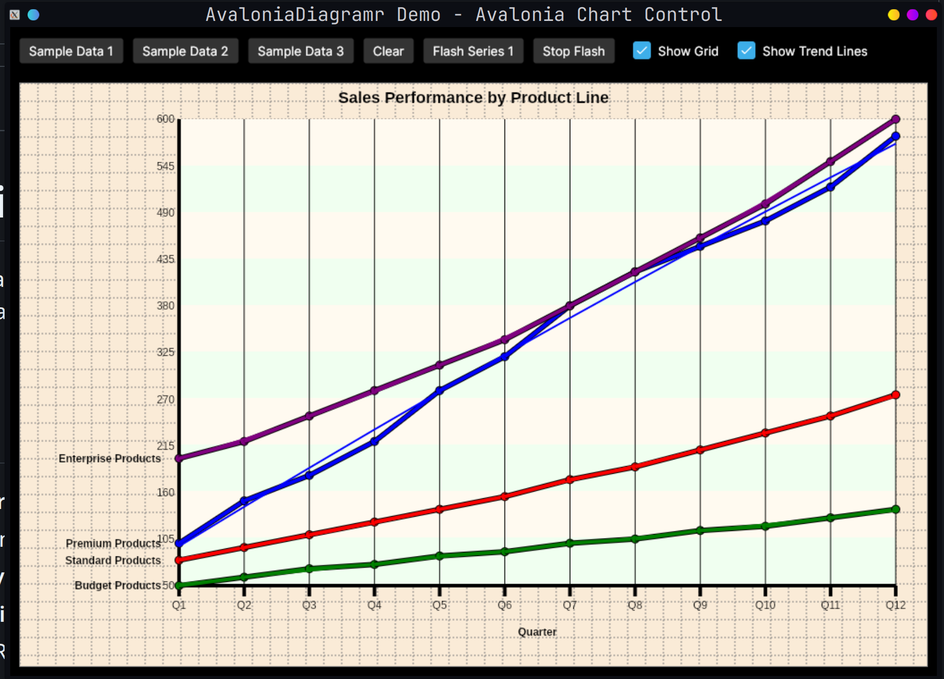
Example 1: Sales Performance Chart
ChartControl.ClearDataSeries();
ChartControl.ChartTitle = "Sales Performance by Product Line";
ChartControl.XAxisLabel = "Quarter,Q1,Q2,Q3,Q4,Q5,Q6,Q7,Q8";

ChartControl.AddDataSeries("Premium Products,100,150,180,220,280,320,380,420");
ChartControl.AddDataSeries("Standard Products,80,95,110,125,140,155,175,190");
ChartControl.AddDataSeries("Budget Products,50,60,70,75,85,90,100,105");

ChartControl.InvalidateVisual();
Example 2: Temperature Variations
ChartControl.ClearDataSeries();
ChartControl.ChartTitle = "Temperature Variations Throughout the Year";
ChartControl.XAxisLabel = "Month,Jan,Feb,Mar,Apr,May,Jun,Jul,Aug,Sep,Oct,Nov,Dec";

ChartControl.AddDataSeries("City A,-10,-5,5,15,25,35,40,38,28,18,5,-8");
ChartControl.AddDataSeries("City B,0,3,10,18,28,32,35,33,26,16,8,2");
ChartControl.AddDataSeries("City C,20,22,25,28,32,35,38,37,33,28,24,21");

ChartControl.DrawRegressionTrendLines = true;
ChartControl.InvalidateVisual();
Example 3: Custom Styling
// Set custom colors
ChartControl.CanvasBackColor = Color.Parse("#2C3E50");
ChartControl.ChartBackColor = Color.Parse("#34495E");
ChartControl.ChartAlternateBackColor = Color.Parse("#2C3E50");
ChartControl.ChartTitleColor = Colors.White;
ChartControl.AxisDrawColor = Colors.White;

// Customize fonts
ChartControl.ChartTitleFontSize = 24;
ChartControl.ChartTitleFontWeight = FontWeight.Bold;
ChartControl.YAxisFontSize = 12;
ChartControl.XAxisFontSize = 12;

// Set data line colors
ChartControl.SetDataLineColor(0, Color.Parse("#3498DB")); // Blue
ChartControl.SetDataLineColor(1, Color.Parse("#E74C3C")); // Red
ChartControl.SetDataLineColor(2, Color.Parse("#2ECC71")); // Green

// Configure visualization
ChartControl.DrawKnots = true;
ChartControl.OutlineDataSeries = true;
ChartControl.DrawLineWeight = 3;
ChartControl.TrendLineWeight = 2;
Example 4: Interactive Flashing
// Flash a specific series to highlight it
private void HighlightSeries(int seriesIndex)
{
    // Set flash color to bright yellow
    ChartControl.FlashSeriesColor = Colors.Yellow;

    // Start flashing the series
    ChartControl.FlashDataLine = seriesIndex;
}

private void StopHighlight()
{
    // Stop flashing
    ChartControl.FlashDataLine = -1;
}
Demo Application
The included demo application (AvaloniaDiagramerControl.Demo) showcases all the features of the control:
- Multiple sample datasets
- Interactive buttons to switch between different chart types
- Flash functionality demonstration
- Grid and trend line toggles
- Responsive layout
To run the demo:
cd AvaloniaDiagramerControl.Demo
dotnet run
Architecture
Data Format
Data series are provided as comma-separated strings:
- First value: Series label (displayed next to the first data point)
- Remaining values: Numeric data points
Example: "Sales,100,150,200,250"
Supported Data Lines
The control supports up to 10 simultaneous data series (indices 0-9), each with:
- Independent color customization
- Individual visibility toggle
- Default color palette (Blue, Red, Green, Purple, Cyan, Magenta, Yellow, ForestGreen, DeepPink, Gray)
Trend Line Calculation
Polynomial regression trend lines are calculated using the Regressor class:
- Configurable polynomial degree (1 for linear, 2 for quadratic, etc.)
- Automatically fitted to each visible data series
- Rendered with thinner lines to distinguish from actual data
Requirements
- .NET 9.0 or later
- Avalonia UI 11.0 or later
License
This project is a port of the original VB.NET Windows Forms TAIDiagramer control to Avalonia UI.
Contributing
Contributions are welcome! Please ensure:
- Code follows existing style conventions
- All public APIs are documented
- Changes are tested with the demo application
Support
For issues, questions, or feature requests, please open an issue on the project repository.
Note: This is a line chart control specifically designed for trend visualization. For other chart types (bar, pie, scatter), consider alternative charting libraries.
| Product | Versions Compatible and additional computed target framework versions. |
|---|---|
| .NET | net9.0 is compatible. net9.0-android was computed. net9.0-browser was computed. net9.0-ios was computed. net9.0-maccatalyst was computed. net9.0-macos was computed. net9.0-tvos was computed. net9.0-windows was computed. net10.0 was computed. net10.0-android was computed. net10.0-browser was computed. net10.0-ios was computed. net10.0-maccatalyst was computed. net10.0-macos was computed. net10.0-tvos was computed. net10.0-windows was computed. |
-
net9.0
- Avalonia (>= 11.2.7)
NuGet packages
This package is not used by any NuGet packages.
GitHub repositories
This package is not used by any popular GitHub repositories.
| Version | Downloads | Last Updated |
|---|---|---|
| 1.0.0 | 156 | 1/10/2026 |